Urban Mobility Conference
Book and Mobile app Design
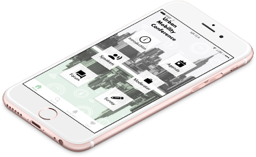
Overview
Spring 2020 NCSU school project
This project consists of two parts:
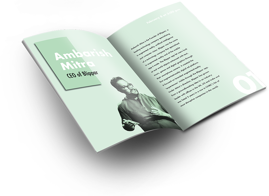
- Designing a modern book (catalog) for conference.
- Designing a mobile application with the same style and language as the catalog.
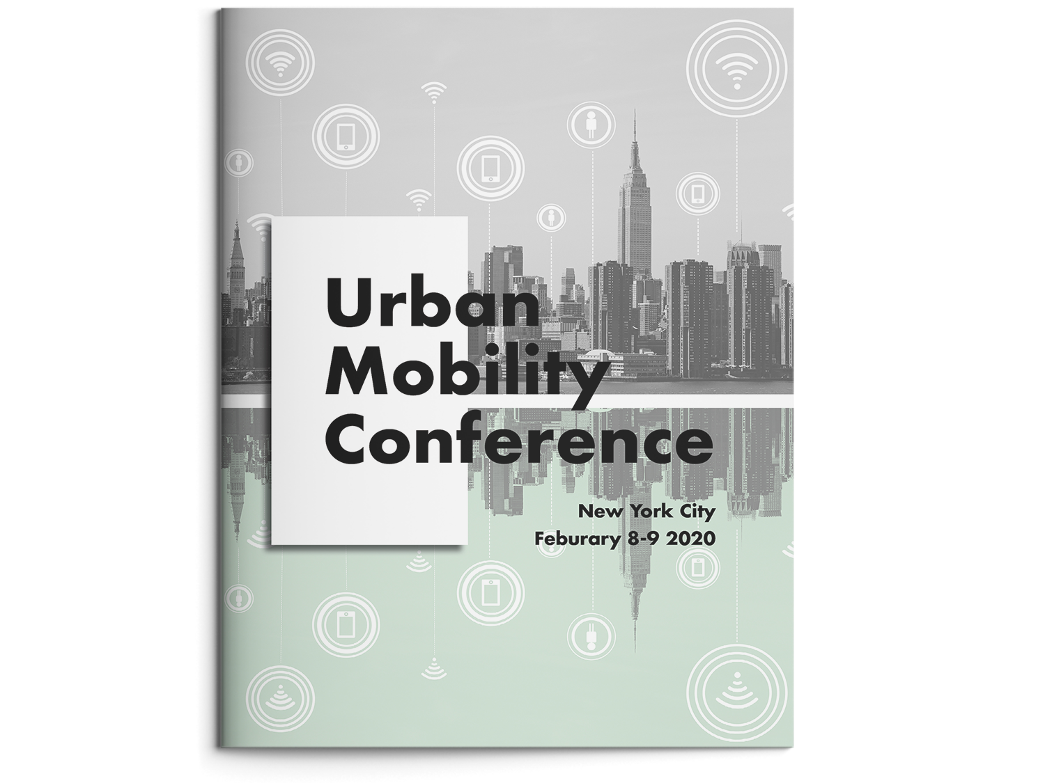
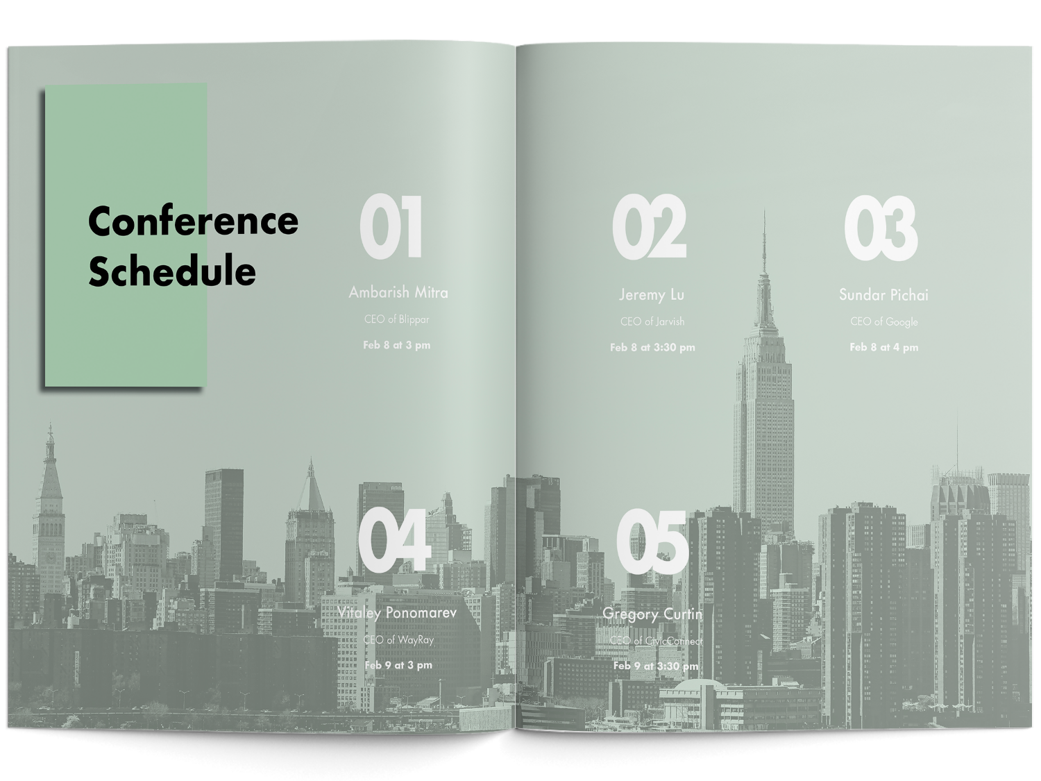
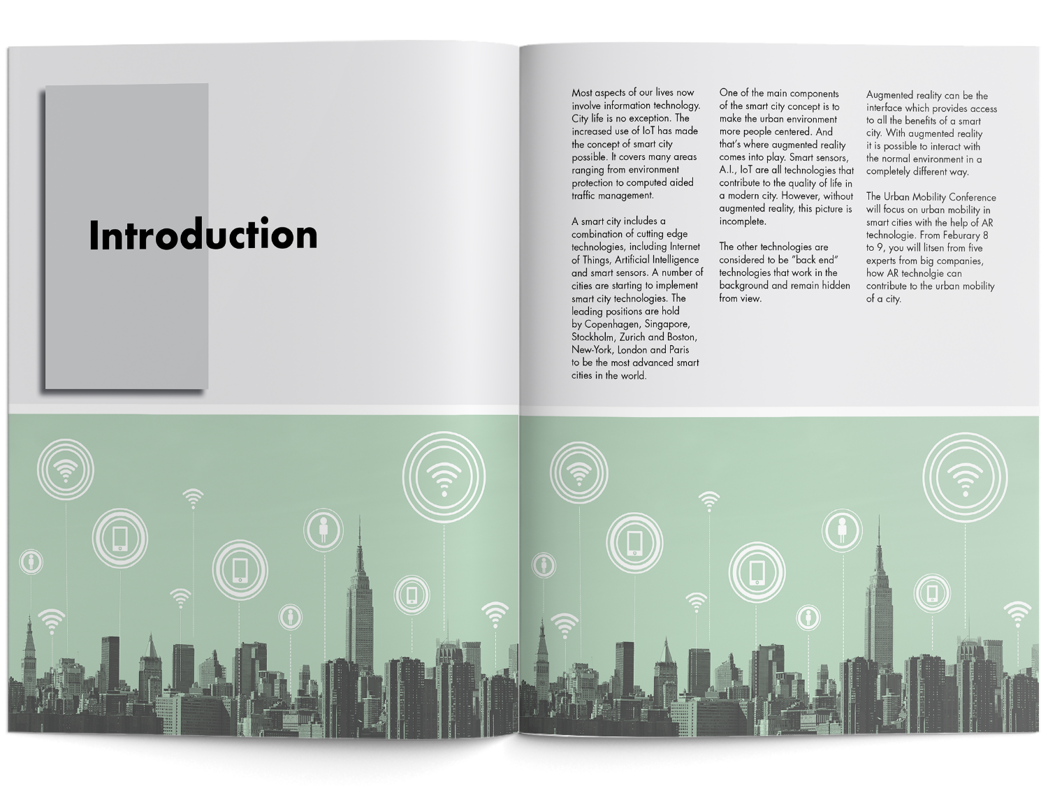
Modern Book Design

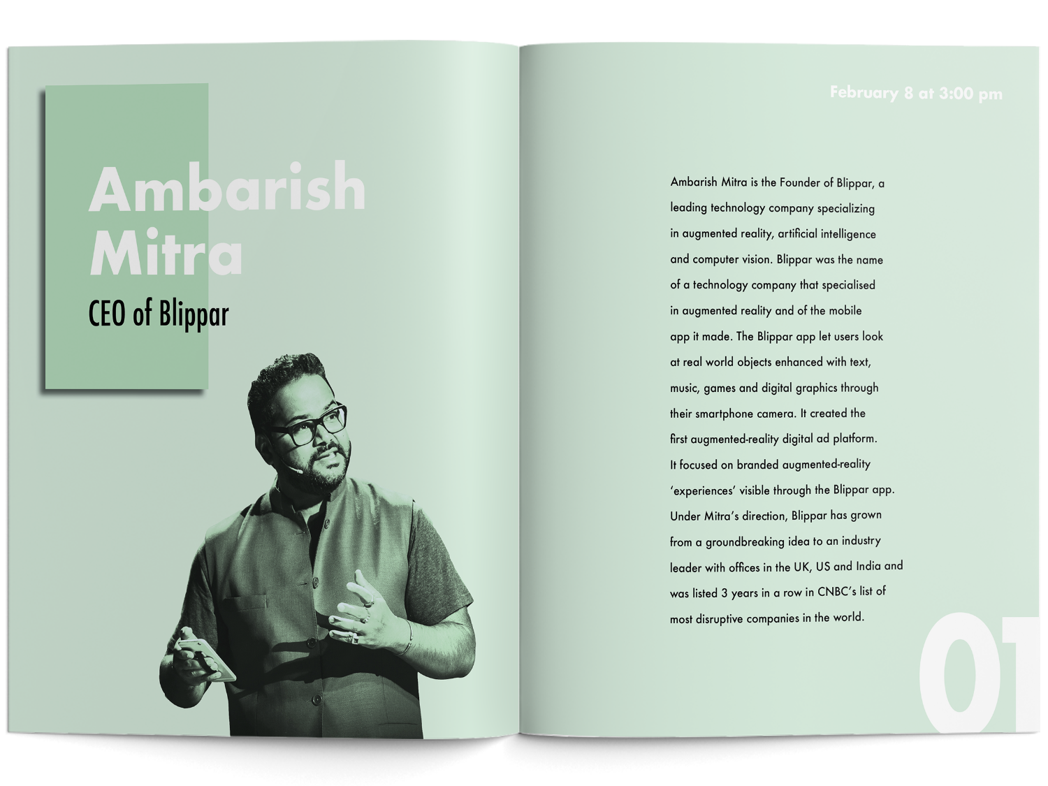
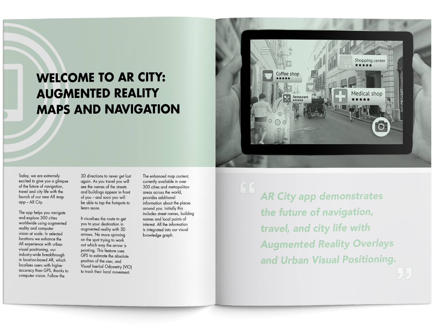
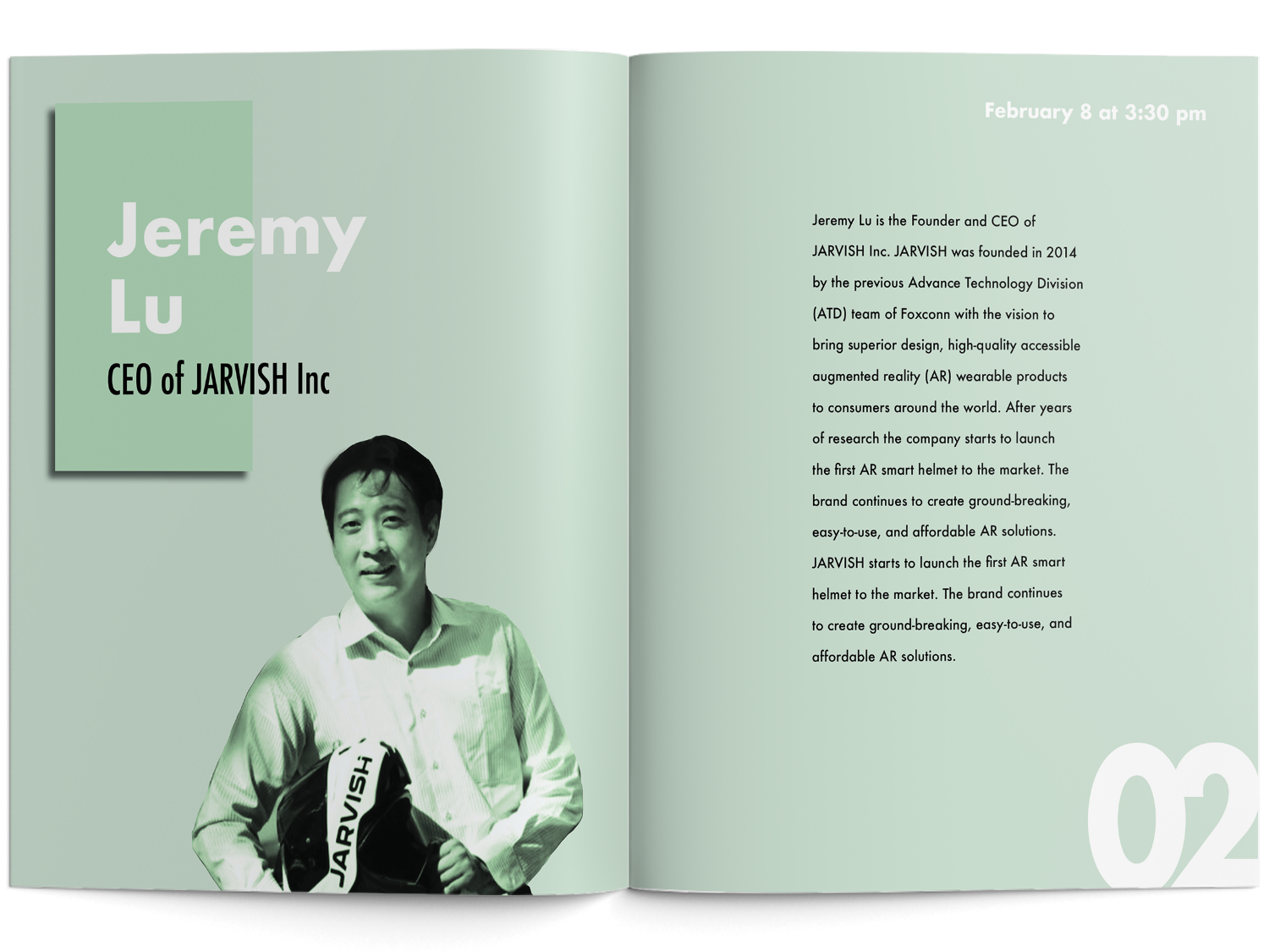
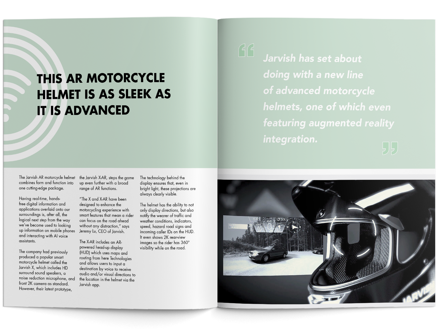
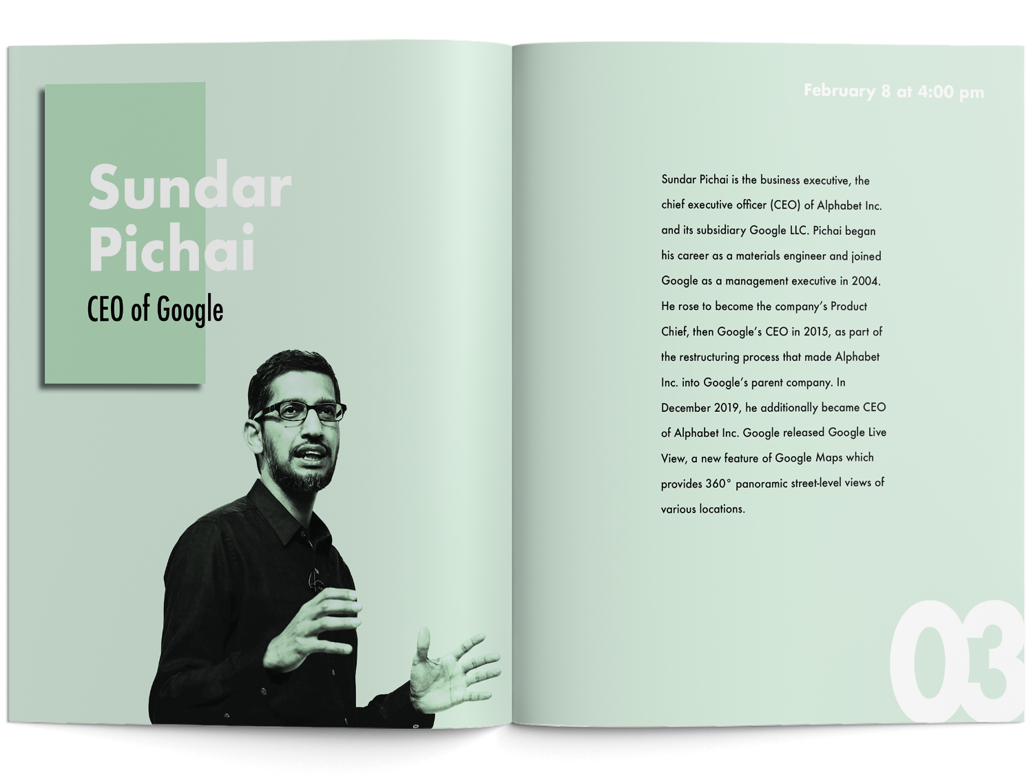
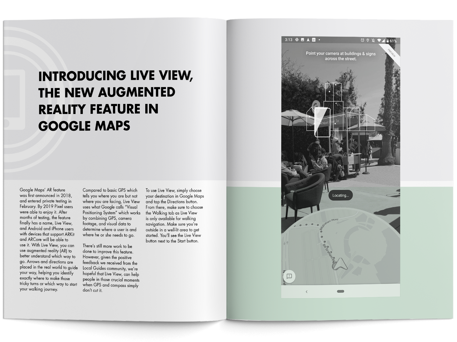
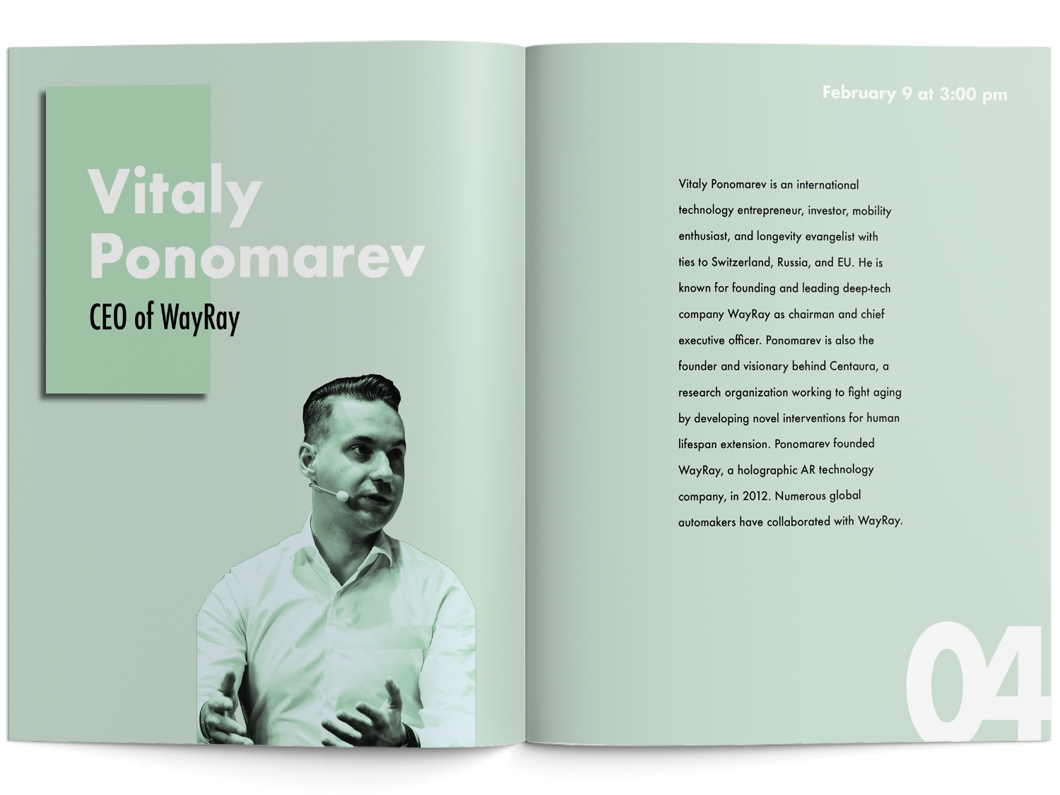
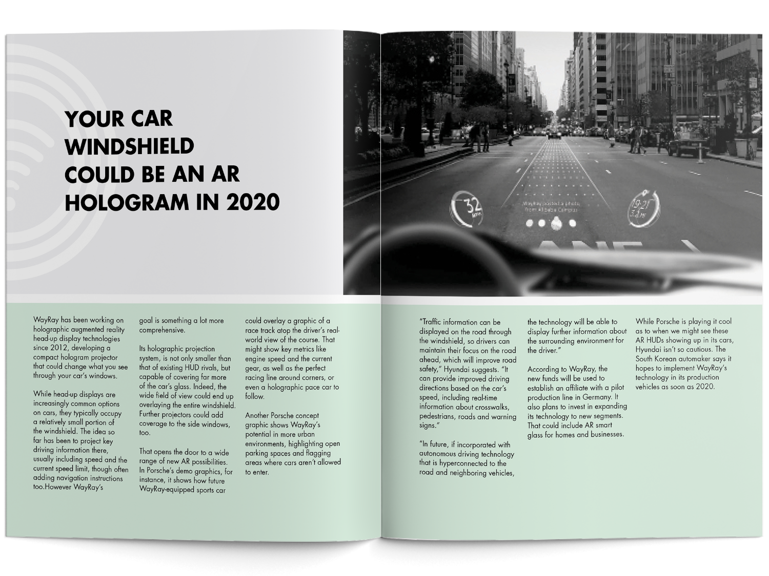
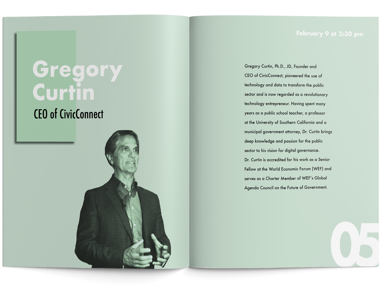
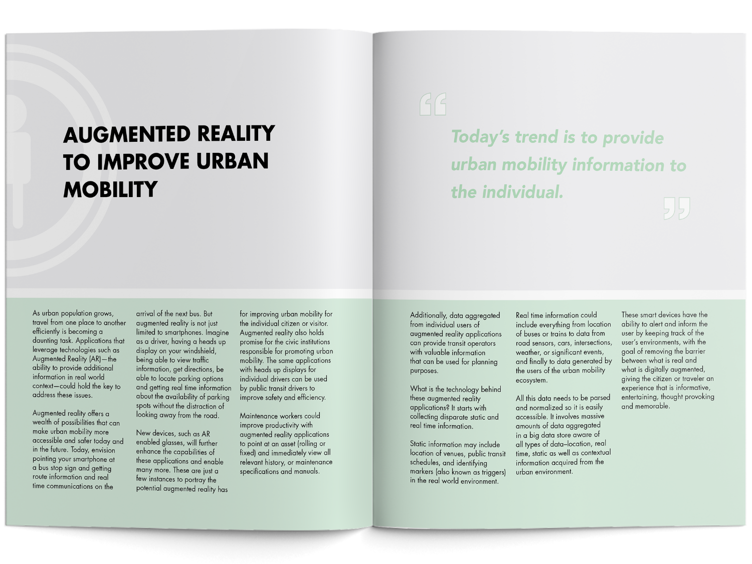
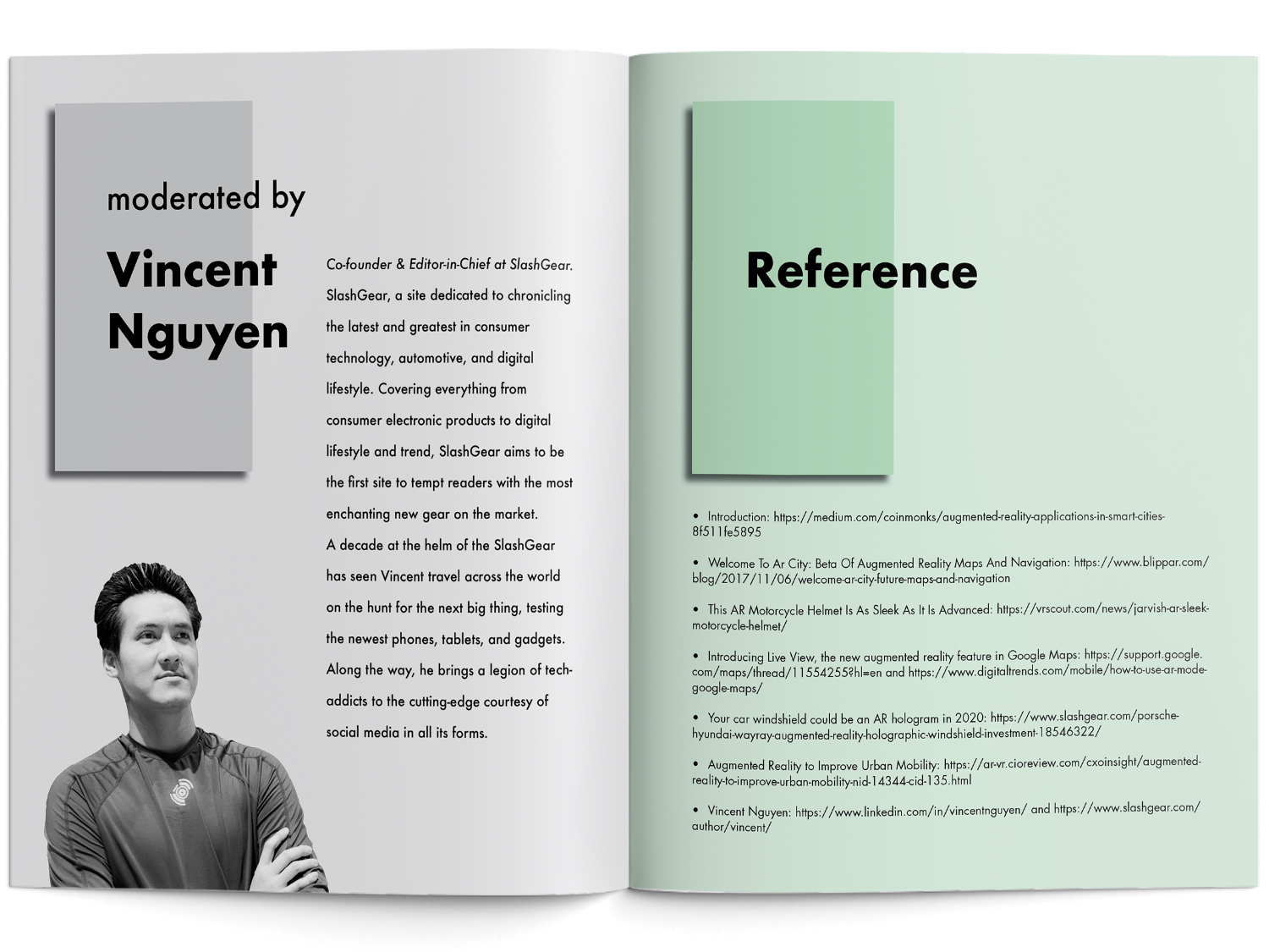
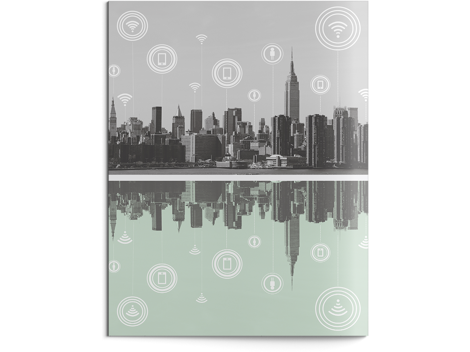
First, we were asked to compile articles, speakers, and workshops into a conference catalog.
This book was designed with the ideals of modern book design in mind.
Challenges
- A finished, two-color booklet.
- Well ordered Adobe document files indicating effective use of layers, grid, master pages, style sheets, and spot color.
Mobile App

Urban Mobility Mobile Application
The second part of this project was to envision our catalog on a mobile device by designing an app. We were asked to create a user interface with the same language as the book, but take into consideration the affordances of mobile devices.
Sketches
At first, I needed to see how the conference app works and what are the needs of users who want to use it. So I conducted different research.
- Find out what are the needs of the attendees of a conference.
- Comparative research, which means I compare similar apps that are close to what my user needs.
Then, I usually start the design process with low fidelity wireframes by sketching on a paper. This is the way I iterate through many design options quickly. On paper, I sketched what are the best features to have in a conference app for attendees.
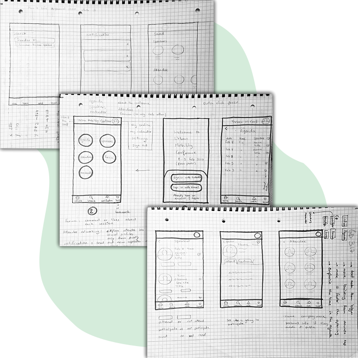
Process of UI Design
I had several steps before designing the final product:
- At the beginning of my design process, I created wireframes for testing purposes. I made several iterations in illustration and Adobe Xd.
- I performed some usability testing and monitor the behavior of my peers from their interaction with the app to reveal possible usability problems. I gathered all the feedbacks from my peers and professor to improve my final design.
- Once I tested out all usability mistakes, I started designing the final screens in Adobe Xd.
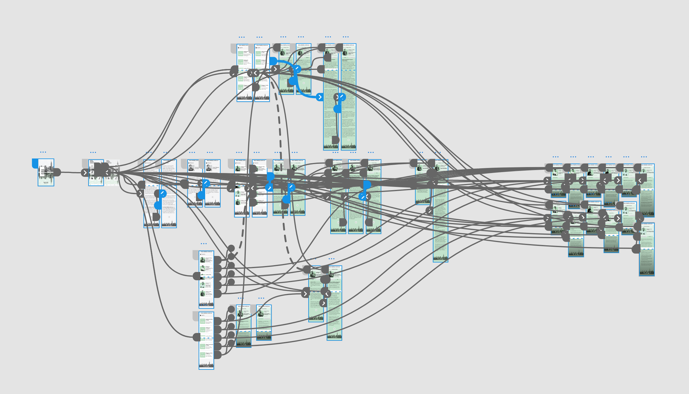
UI Design
I have followed the style of the booklet to design the app version. Since the conference is about urban mobility with the use of AR technology, I designed the app to represent this concept. Starting from the cover with the image of NYC having the technology elements to the Agenda section (Gregory Curtin) or Speaker section (Ambarish Mitra) when clicking they are coming out of their frames, I tried to implement the AR technology concept.
Click to Interact with the prototype
Made with Adobe Xd
Final Version
For the final version I have also made an opening for the app that suited the concept of the conference.
Reconstructing the city (buildings coming out) with having an eye on the new technology to help urban mobility in cities.
Opening of the app added to the final version
The opening made with After effects and Keynotes
Time for my reflection...
- This project was an opportunity to learn new software and who to bounce from one to another.
- For the booklet, we had to print and bind it. It was my first time and binding your own book is also a lot of fun as you get to design it yourself! Seeing the result in your hand made me proud.
- I have also learned a lot from designing the app which was also my first time doing it. Throughout the process, I didn't have the appropriate users to test it which I found out that choosing the right user is an essential part of the design process. But the app turned out well and let me tell you I got an A for the whole project! :)
"Design is so simple, that's why is so complicated"
Uh oh, you have reached the end of this case study!
Do not worry! I have other projects that are waiting for you to check them out!
Thank you for your time and see you in the next project :)
