Scroll down the mockup to see the full length.
⚠️ WARNING ⚠️
Watching may hurt your eyes or bring nostalgia and get lost in your old memory.
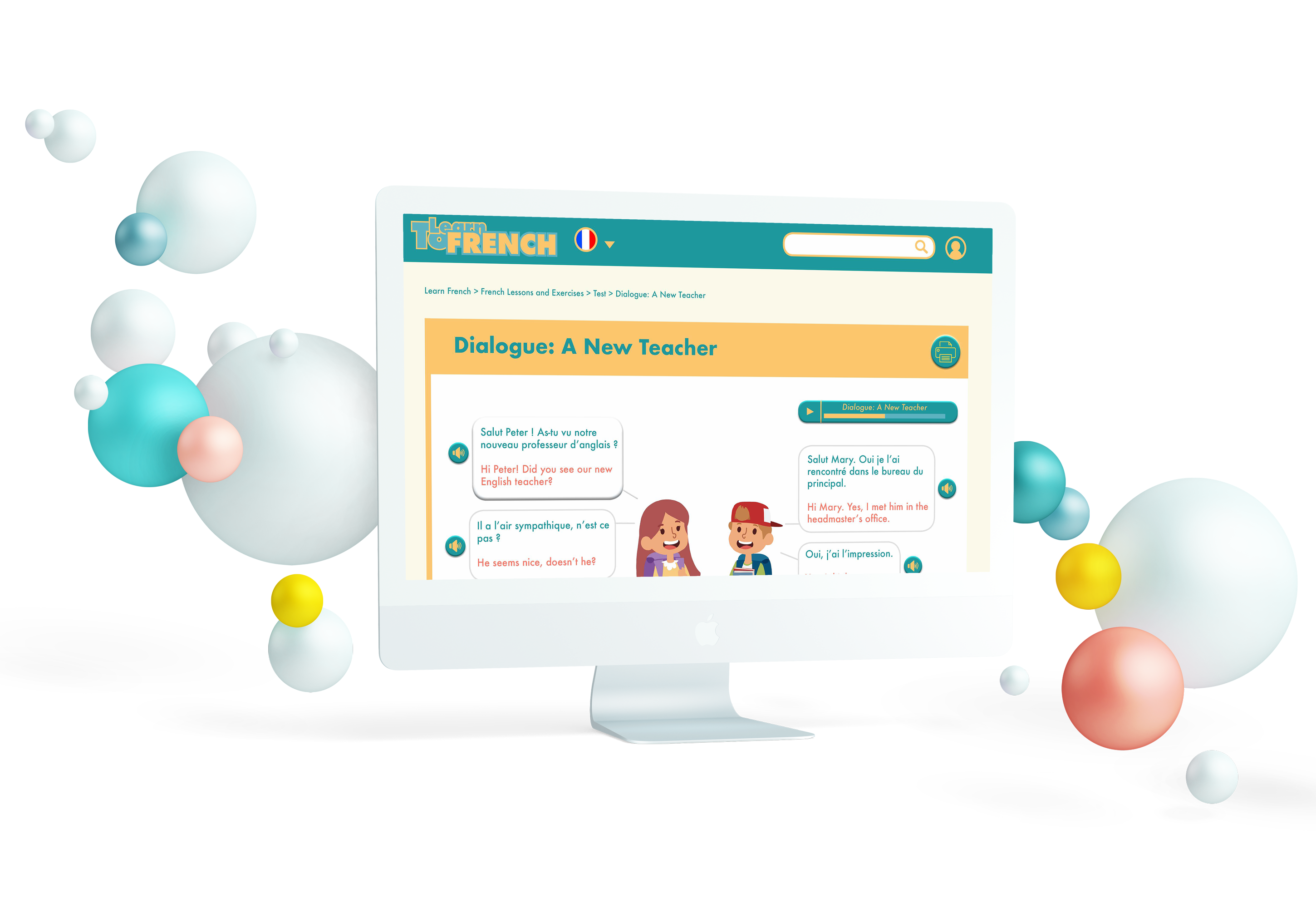
The website toleranfrench.com is a site to learn French! by a French teacher from France. The lessons on the website are free and have many resources for English speakers to learn a new language for all levels.
This project was my first free of choice UX school project at NCSU. The project was about finding one existing bad visual display and redesigning it. I chose one webpage of tolearnfrench.com which has a long way to call it an appealing and user-friendly website. This project helped me to practice my knowledge of UX at that time and expanding it.
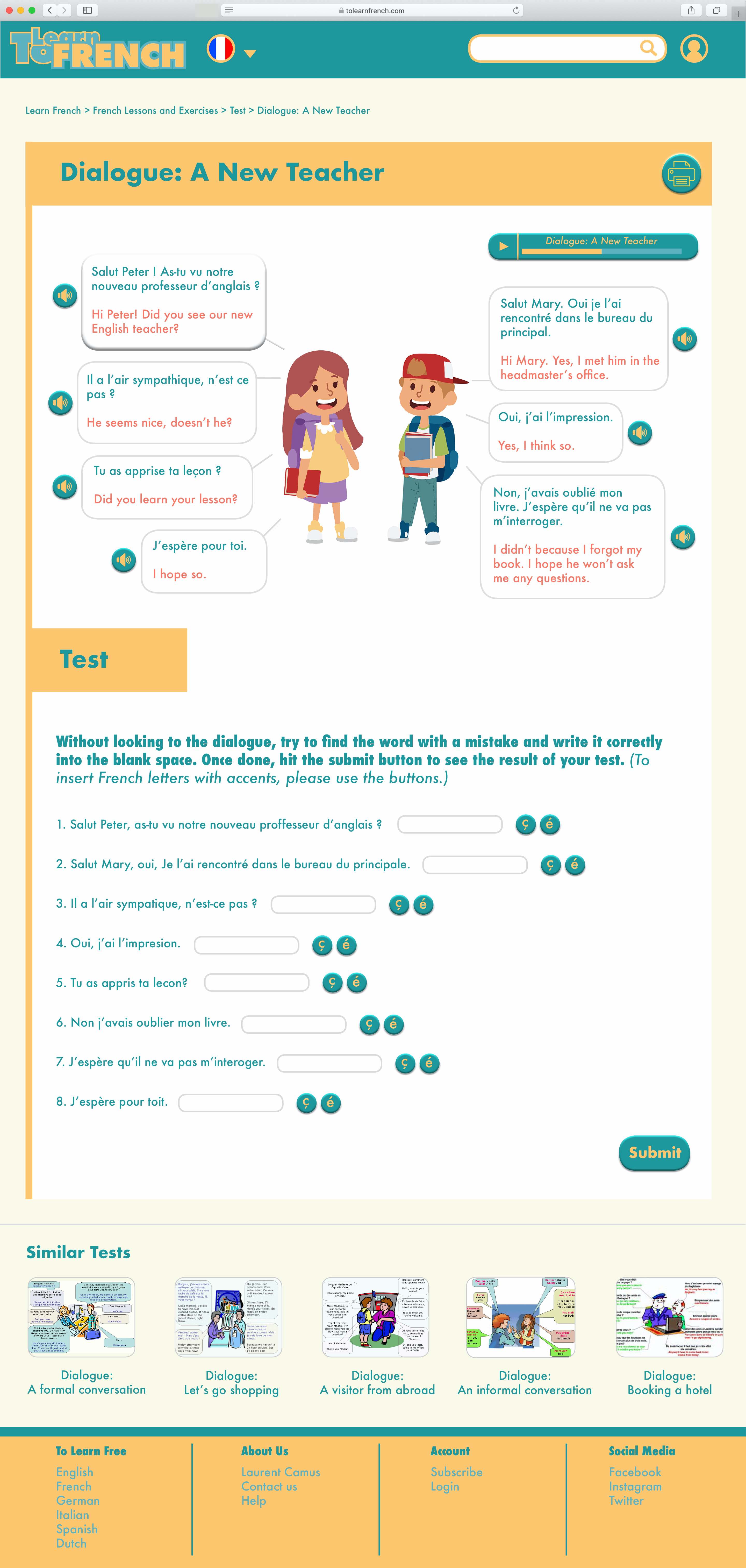
Scroll down on the mockups to see the full length of the two versions.

VS
Now, do you want to know the full story of this project? Sit tight and let's begin with the journey behind it.
The website has a lot of useful resources but most of them are burry behind layers and finding them can make the journey hard and potentially the user will leave the page and find a better one. Therefore, my objective was how to access to those resources with minimum click and make the learning experience fun and easy as possible.
Website Redesign
UX Researcher, UX/UI designer
Solo
12 days
Balsamiq, inDesign, Keynote, Illustration, Procreate
I conducted Heuristic Evaluation and then Comparative Market through research to best understand the problem space and identify opportunities where I could create an impact.
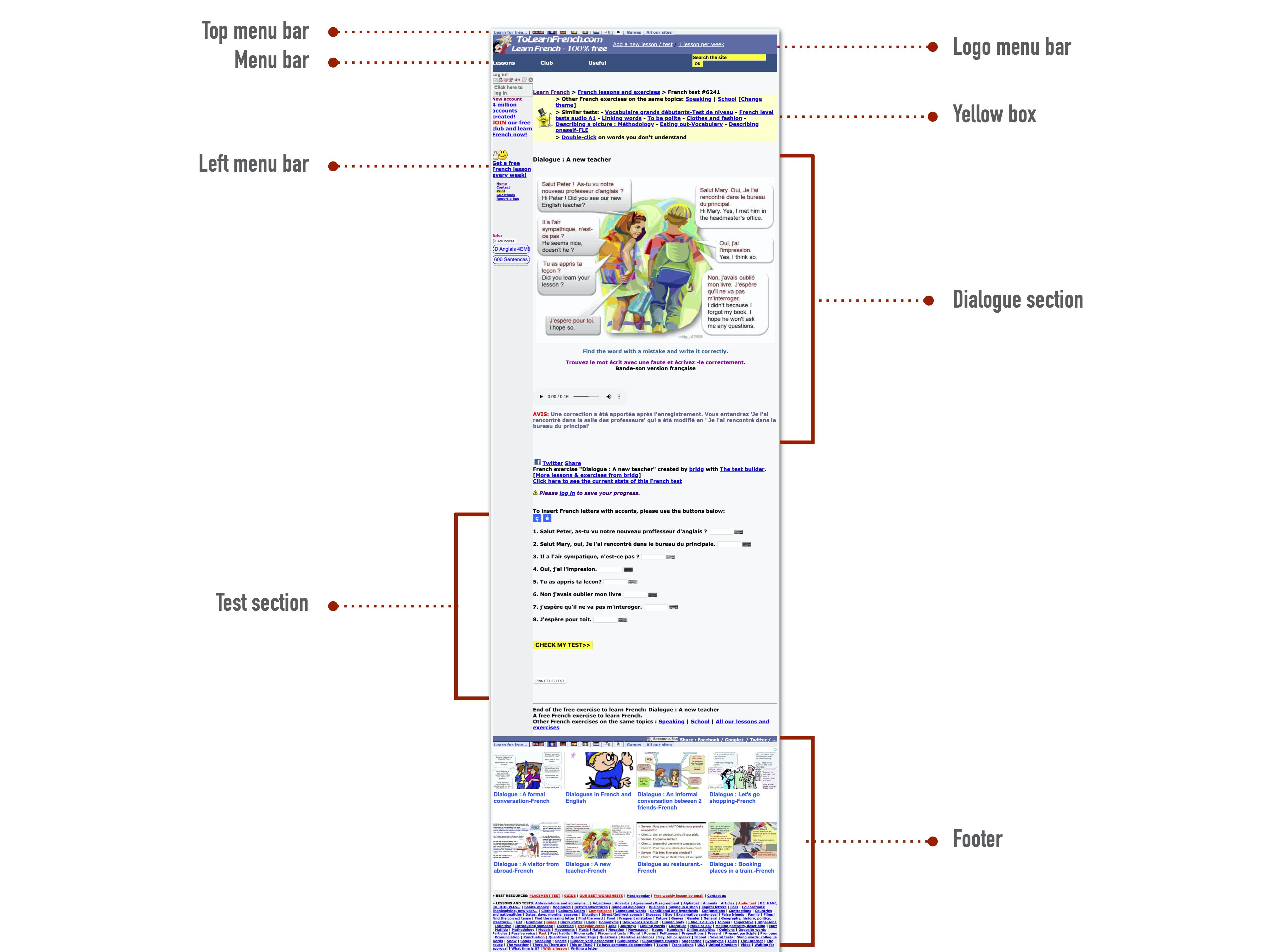
This webpage is a quiz page where the users evaluate their knowledge of what they have learned. The main parts are the dialogue section and the quiz section.
Before starting analyzing the website, I asked myself those questions:
After doing some user research about the website, as the first step of the redesigning process, I started with deconstructing this one webpage by approaching it with Nielsen's heuristic evaluations.

Scroll down the mockup to see the full length.
⚠️ WARNING ⚠️
Watching may hurt your eyes or bring nostalgia and get lost in your old memory.
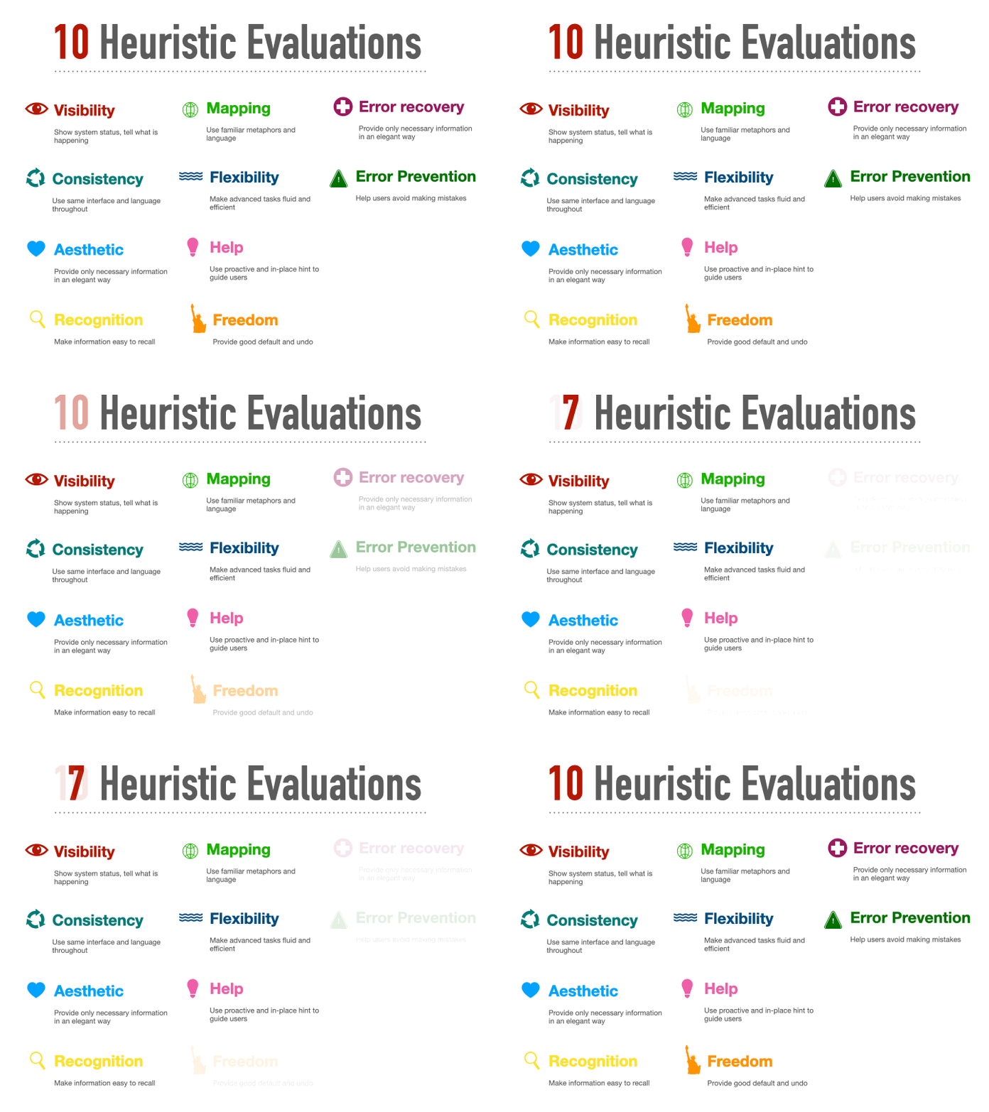
Nielson proposed a set of basic heuristics to deal with usability issues in a design. He categorized the usability issues into 10 groups. Each group evaluates the design from a different usability standpoint.
Since I had one page to evaluate and I couldn't show the interaction between webpages of this website, I used 7 heuristic evaluations instead of 10.
The next 3 steps showcase my evaluation process.
For making my evaluation easier, I labeled each section so we know what's where.
I evaluated the webpage with the heuristic evaluations section one by one to find out the problem of each section of the webpage.
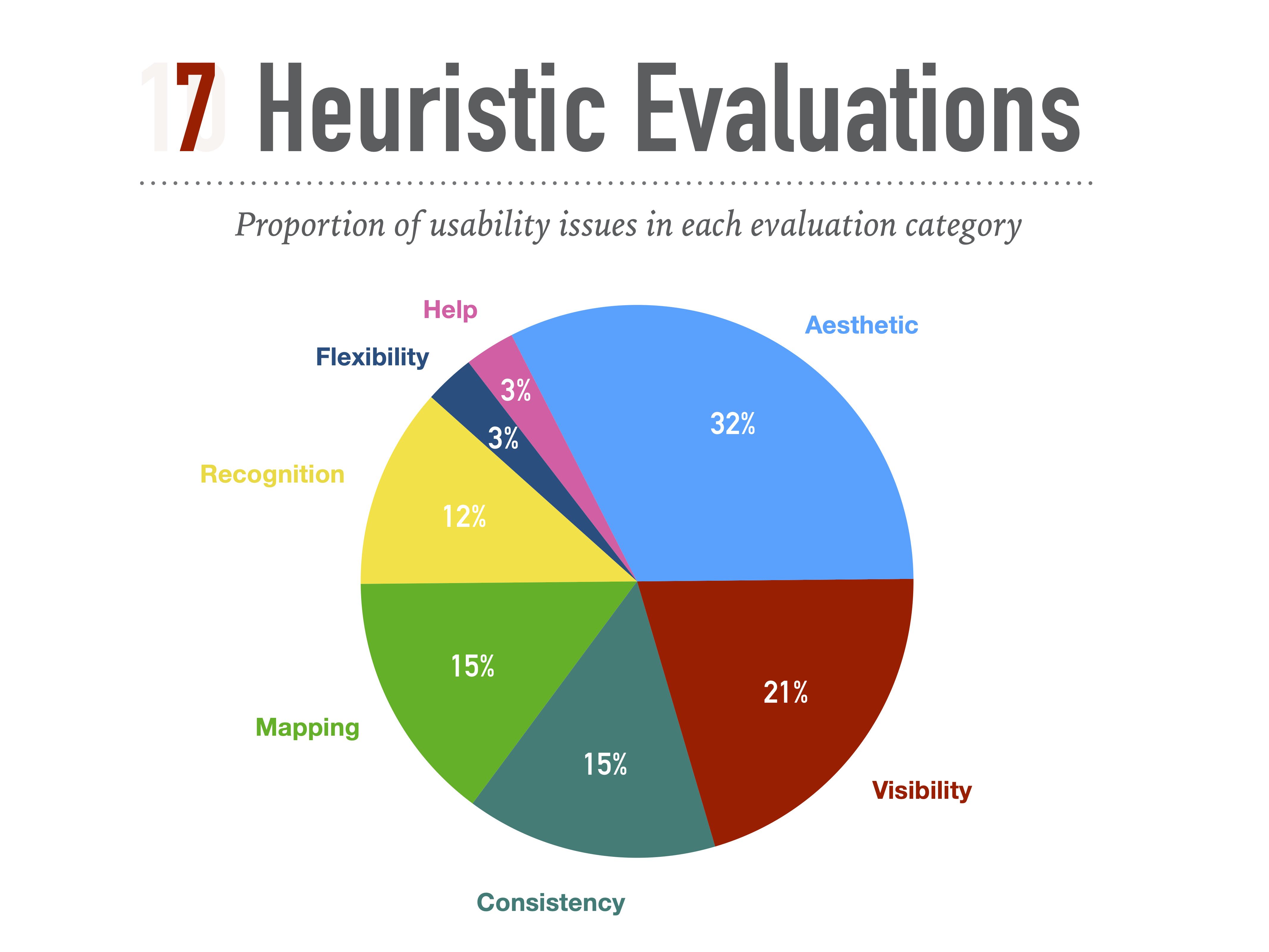
Base on this pie chart, the most common issues are found in the aesthetic category. If we add up the aesthetic, visibility, consistency and the mapping percentage number together we will found out that 83% of the usability issues are in those categories.
Now that I know where are the problems I needed to start researching how to start redesigning the website to make its look and function up to date. For that, I started to watch thoroughly how other successful similar websites in this market are working?
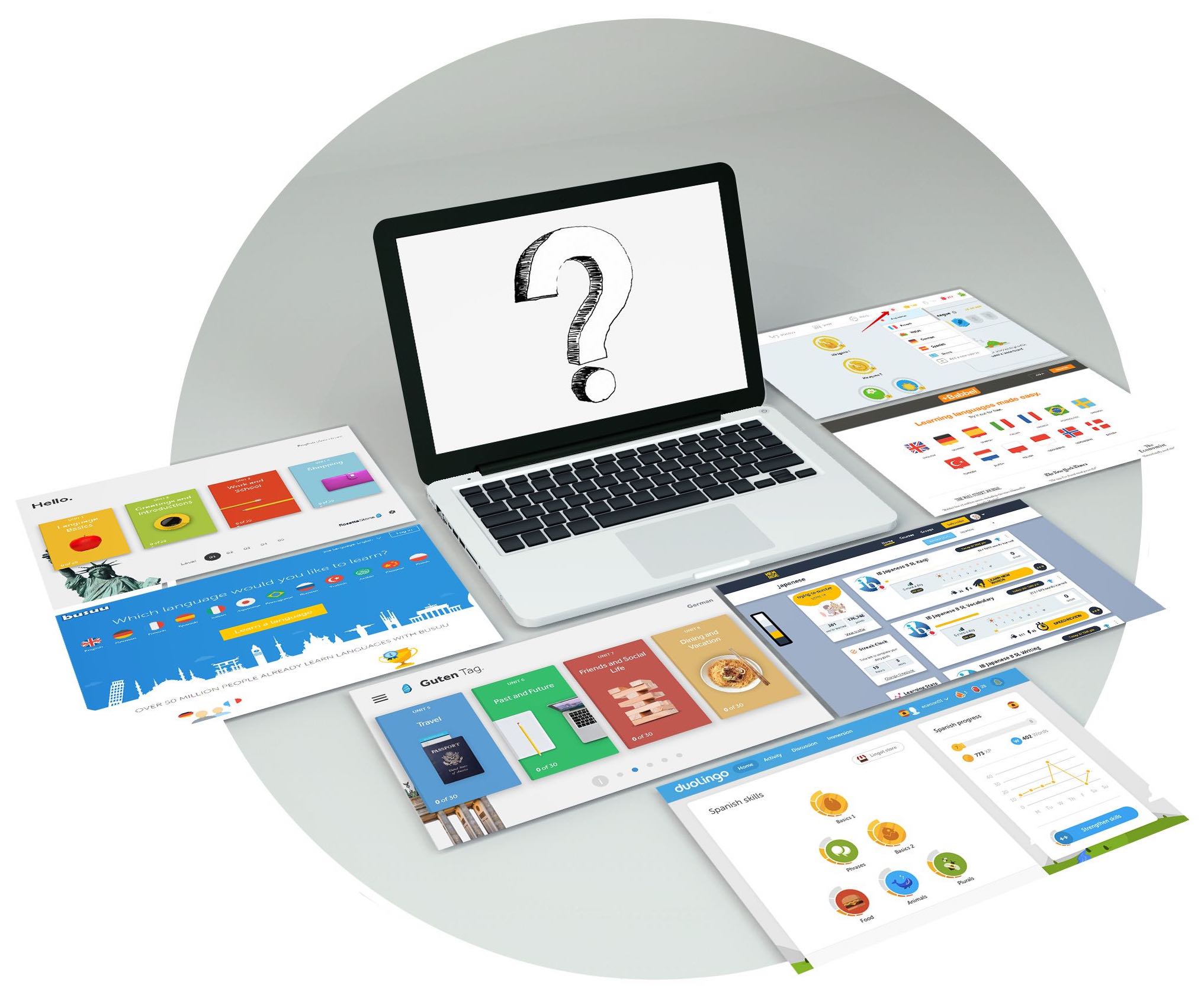
I conducted thorough research of potential competitors and discover successful learning websites that are comparable to my goals.
Duolingo and Memrise were the most appealing ones in terms of feeling confident to start learning a new language. They are also one of the most popular in terms of number of users they have. Mainly because they are free but also they are fun to use. Other examples: Rosetta Stone, Babbel and Bussu.
The competitive and comparative research helped me to find out which features were the most common and strongest that make the user feel confident of their choice to learn a new language technically and aesthetically. Even though their strongest point was mostly in making the journey of learning easy to use, I needed to focus on features that make one webpage stand.
I gather all the features that will address my goals to show the full potential of the webpage.
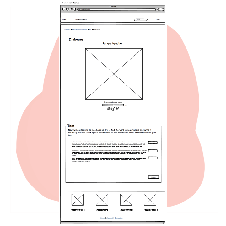
In this section, with the informations that I gather from my previous steps, I began to define what might our webpage look like.
First, with pen and paper and then with Balsamiq software I sketched many iterations of the website. For this step, my main purpose was to get ride of the none essential elements from the webpage and just leave what's matter for the user when they want to take the test.
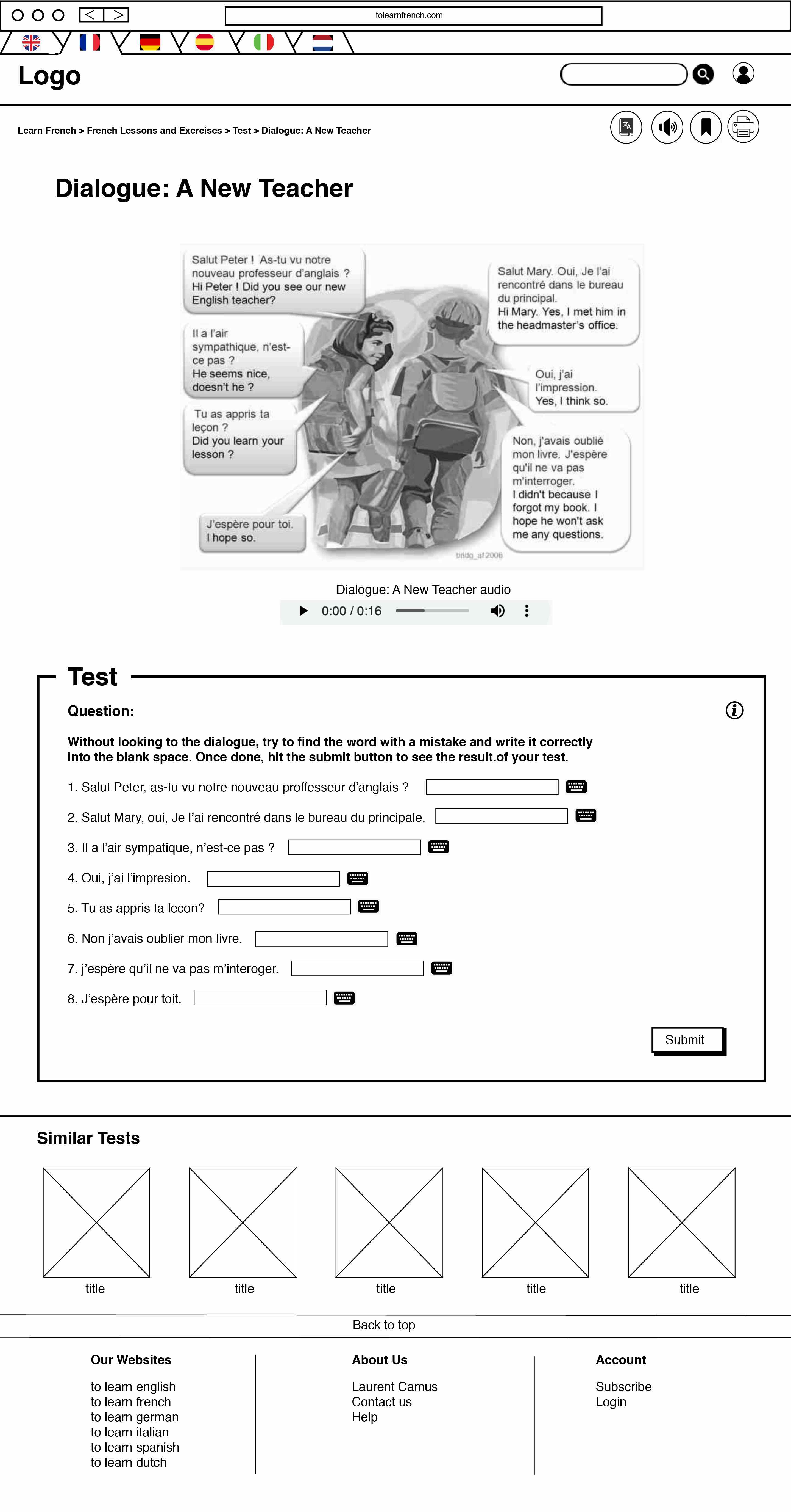
For this step, I showcased details in the prototype for a better communication and also to test and find potential problems.
I have tested on some users and see the user flow and how they interact with it. Based on each task that I have assigned user to do, I have found the answer to these questions:
Does this prototype help them to achieve their goals? Does is meets users' needs?
At the end of my testing, I got a better understanding on how to design the webpage. For the visual aspect of it, the feedback from my peers and professor led me to find new design ideas.
In this part, based on the researches from previous steps, I tried to redesign the webpage with a different modern style in high fidelity mockups version.
Once I tested out all usability mistakes, I started designing different versions of the final screens.
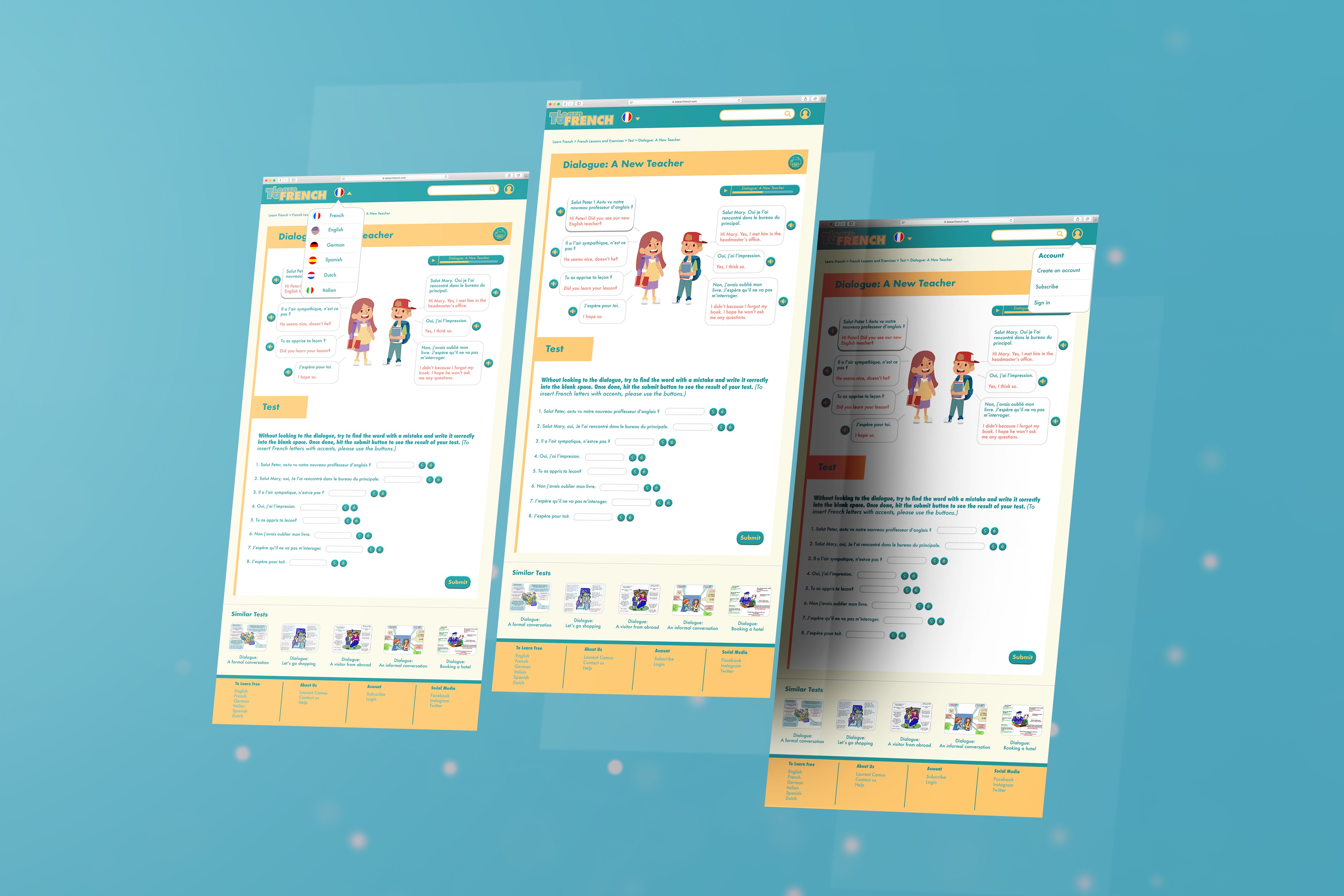
Placement of elements: Since this webpage is a test, the users should not be distracted by unnecessary elements. Therefore, I have designed the whole system of the page in a way that the user flow will be logical and user friendly.
Visual style: To follow the project assignment which was meant to be just redesigning the visual aspect of a bad display, I have tried to redesign it with the UX point of view. Therefore, the result came out better than I was expected. The style that I have chosen base on my research suited well the learning experience in a fresh and modern way. (Sorry, not sorry nostalgic people!).
Title/logo: At first I wanted to design an icon as a logo, but then with my research and user testing I found out the title itself is well explanatory for its content. I just needed to give it a modern touch.
Menu bar: I can't tell which section gave me a hard time for the makeover but the menu bar was definitely the one that was screaming help! I rearrange the flag menu in one place. I have put some second-hand necessary elements that were visible all over the webpage under the account section. For facilitating the navigation between pages and for the user to find out where they are located on the website, I have added breadcrumbs under the menu bar.
After many iterations, I have chosen a fresh visual style that suited well the learning experience. From colors, fonts, illustrations to the placement of elements, all of them make the experience fun and enjoyable for the user. I wanted something that anyone can use and feel confident from any ages.
Now not only the resource of the webpage are useful but the visual will help the user to have a better experience while taking the test.

Uh oh, you have reached the end of this case study!
Do not worry! I have other projects that are waiting for you to check them out!
Thank you for your time and see you in the next project :)