NASA Diminished Reality
Controlling Auditory Diminished Reality Through Physical Gestures
Overview
Fall 2020 NCSU
This project started with a collaboration with NASA and Georgia Tech University.
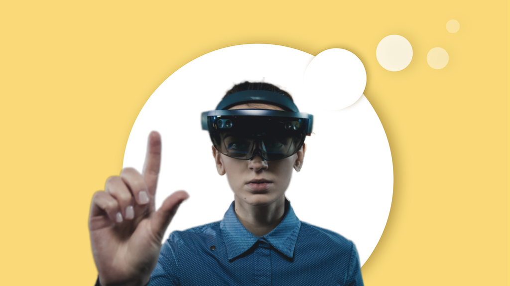
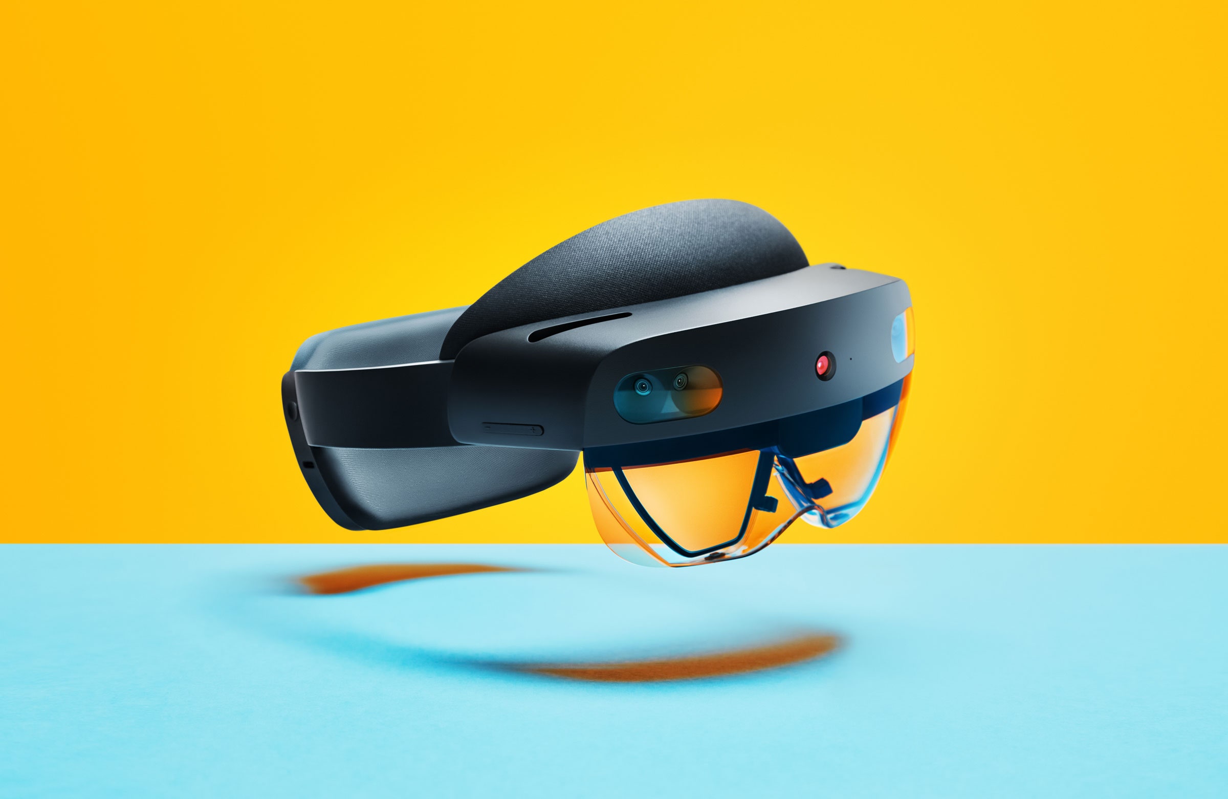
In this study we investigate the ways in which one may choose to de-emphasize the auditory aspects of their surroundings and its subsequent effect on cognitive state and performance using a hypothetical headset modeled similarly to the Microsoft HoloLens 2 system.
As the headset is still in the design and planning stages, we mimic DR by having users complete a task in a video conference call during which they make physical gestures to indicate how they’d prefer to interact with an auditory distraction.
With the ultimate goal of extending our findings to the long-term space-flight domain (for astronauts), we endeavor to assess the benefits of using an auditory DR aid in dynamic environments.
See the full detailed report of this project here.
Product
Gesture Design for Diminished Reality Headset
My Role
UX Researcher, UI Designer
Team
Interdisciplinary team of Human Factor Psycology, Computer Science, Physiology and Graphic Design
Duration
2 months
Client
NASA and Georgia Tech University
Goals
- Our goal is to design and evaluate a diminished reality control and display system.
- Gather information concerning how users limit volume-based distractors, as well as feedback regarding if physical gestures feel best for de-emphasizing audio.
- We endeavor to assess the benefits of using an auditory DR aid in dynamic environments such as long-term space flight domain.
- See how levels of auditory de-emphasis should be displayed to the user when adjusted so that they are aware of the degree to which an audio stimulus has been diminished.
Challenges
- There are no research on how users can interact with de-emphasized elements or how DR should be displayed.
Discovery
Diminished Reality
- Augmented Reality - adding additional visual or auditory elements to the environment.
- Diminished Reality - removing or de-emphasizing visual or auditory elements from the environment.
- There are no research on how users can interact with de-emphasized elements or how DR should be displayed.
Initial Investigation
- Assessed control capabilities of similar technology, specifically the HoloLens.
- Primary Study Questions:
- How do you control diminished reality?
- What should the potential control system look like?
- Do physical gestures serve as an intuitive and effective means of interacting with audio and diminishing it?
Task Analysis
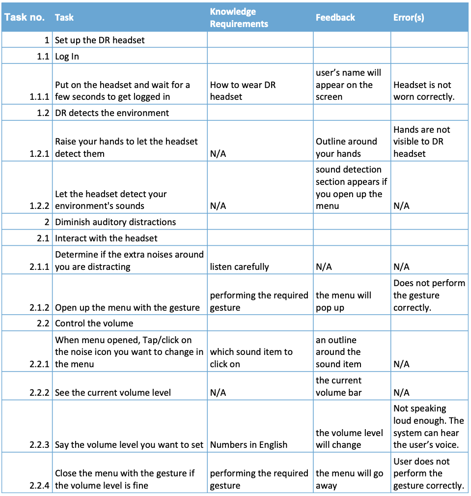
Using document analysis of multiple public records and personal documents of HoloLens 2 AR headset and spaceflight emergencies, we deconstructed the required steps in using the DR headset by an astronaut.
Since technology which focuses on DR has not been built yet, assessing one of the latest AR devices helped us in understanding the user’s task in changing reality with a headset based cognitive aid.
For each step in the task, we assessed the required knowledge in setting up and using the DR headset, as well as potential feedback that would indicate to users that they performed that step in the task correctly.
After reviewing the Hololens 2 headset, we could identify the steps of the process that users need to pay more attention to so that they could avoid any errors.
Decision Acting Diagram
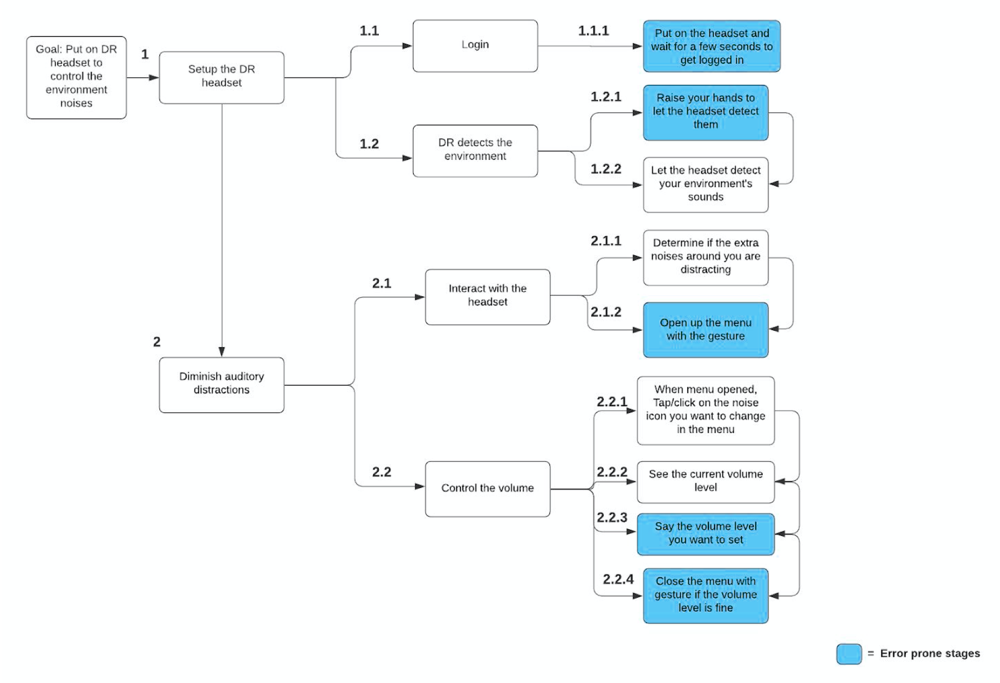
We used the information from the task analysis to create a decision action diagram.
In this diagram, we expanded upon the task that was analyzed in the task analysis.
The task flow through the DR headset is shown there using arrows which show the interconnectivity of each stage. There are two major tasks that have been broken into multiple subtasks.
Based on the errors column of the task analysis table, we highlighted the stages where users may encounter errors that prevent them from continuing to the next step or completing the task.
Heuristic Analysis
Since there is no current way to analyze a comprehensive control system for diminished reality, as such a system does not currently exist, we evaluated the design of the HoloLens specifically looking at the methods for audio adjustment.
Three evaluators independently assessed the usability of each component listed against the heuristics and provided a rating. An additional rating was given in assessment of the component’s ability to control or display audio. These scores were based on a 0 to 4 rating scale to assess the severity of usability issues, as well as a 0 to 3 rating scale to assess how well the components allow users to adjust audio. The two scales are as follows:
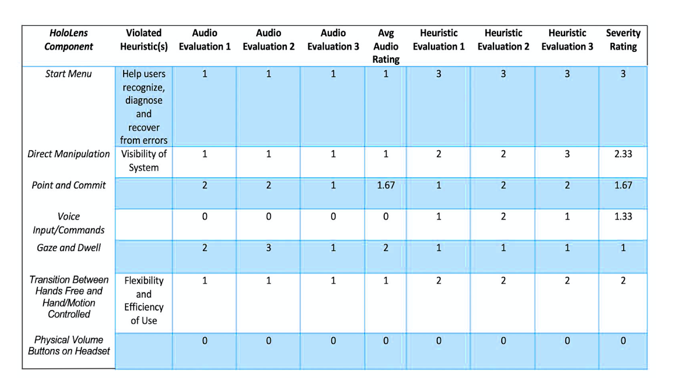
- Severity Ratings for Usability
- 0 = I don’t agree that this is a usability issue at all/directly adjusts volume of audio
- 1 = Cosmetic problem only: need not be fixed unless extra time is available on project
- 2 = Minor usability problem: fixing this should be given low priority
- 3 = Major usability problem: important to fix, so should be given high priority
- 4 = Usability catastrophe: imperative to fix this before product can be released/does not control audio in any capacity
- Audio Control Ratings
- 0 = directly manipulates audio
- 1 = allows users to view audio status/volume, some potential capacity for control
- 2 = allows users to view audio status/volume, no capacity for control
- 3 = does not control audio in any capacity
Define
User Definition
In general, we believe our findings and recommendations are generalizable for the development of an auditory cognitive aid to be used across multimodal professions. So for this study we defined different targets.
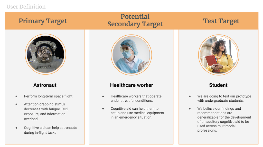
Our primary targets are astronauts who perform long-term space flight. For an astronaut, focus on the operator is imperative, as the human ability to ignore distraction or inhibit reaction to attention-grabbing stimuli decreases with fatigue, CO2 exposure, and information overload - all of which are likely to occur in prolonged space-travel.
Our secondary target users are the healthcare workers that are operating under stressful conditions.
We believe that cognitive aid can help these two target groups to perform better under stressful conditions.
For testing our prototype we decided to recruit undergrad students from NCSU.
Personas
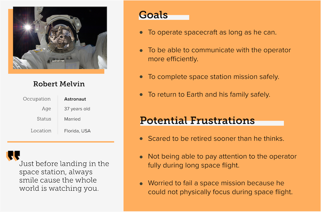
We created two personas based on our users to guide our ideation process and to further illustrate how diminished reality can help in the situations indicated.The personas helped us to understand our users’ needs, goals and potential frustrations.

Storyboard
We made a storyboard to see how the user is going to interact with a DR headset to reduce a sound.
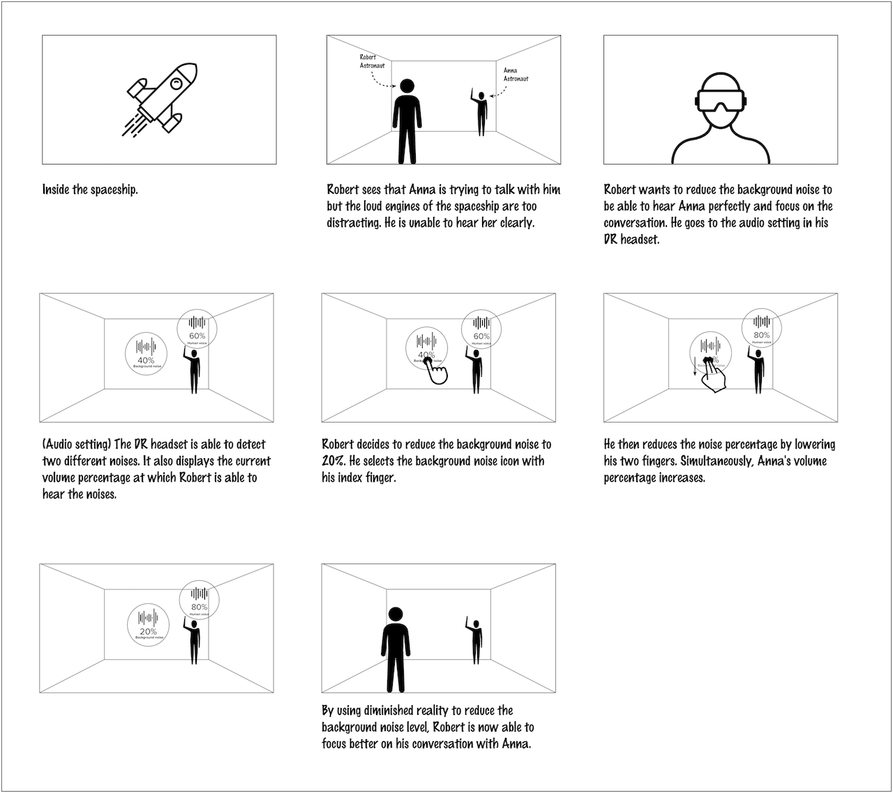
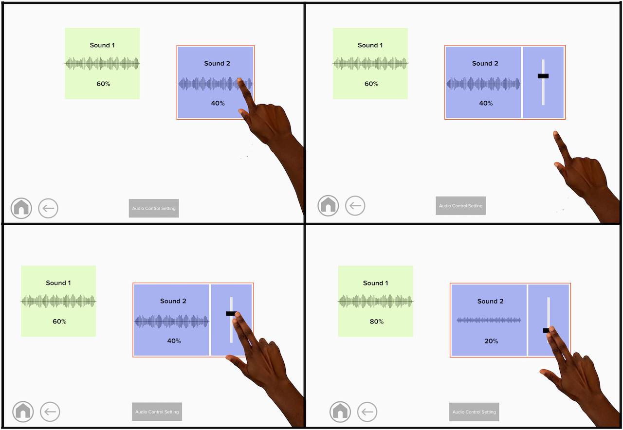
Here, in this scenario, Robert and Anna are inside a spaceship. Robert sees that Anna is trying to talk with him but the loud engines of the spaceship are too distracting. He is unable to hear her clearly. So to be able to hear Anna perfectly, he needs to reduce the background noise. For doing that, he goes to the audio setting in his DR headset. The DR headset is able to detect two different noises. It also displays the current volume percentage at which Robert is able to hear the noises. He clicks the background noise and reduces it to 20% by lowering his two fingers. In the end by using the diminished reality Robert was able to focus better on his conversation with Anna.
Develop
Assesing Physical Gestures
- Originally decided to focus on using predetermined physical gestures.
- Have participants complete a reading task or watch a video.
- Mimic auditory de-emphasis over Zoom.
- Pre- and Post-Test Surveys to gather additional qualitative information.
Wizard of Oz Method
We did some research and detected the tasks our users are supposed to do to interact with the DR system, after that our team went through the cognitive walkthrough step to define the process of prototyping.
We found wizard of oz and zoom video conferencing software the best method for our user research and prototyping for 2 reasons, first of all, we consider our project as the very first steps in designing an interaction system for the DR headset so we are safe keeping it simple and lo-fi during this stage.
Secondly, the pandemic of COVID-19 halted all in-person user research so we were not able to use a holokit or a similar tool to simulate AR/DR experience.
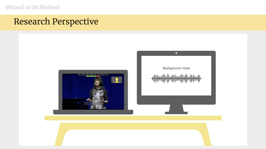
For our wizard of oz study, we used dual monitors, one screen for sharing with the user and showing the interface to the user and one for controlling the audio distraction by the wizard that was one of the team members.
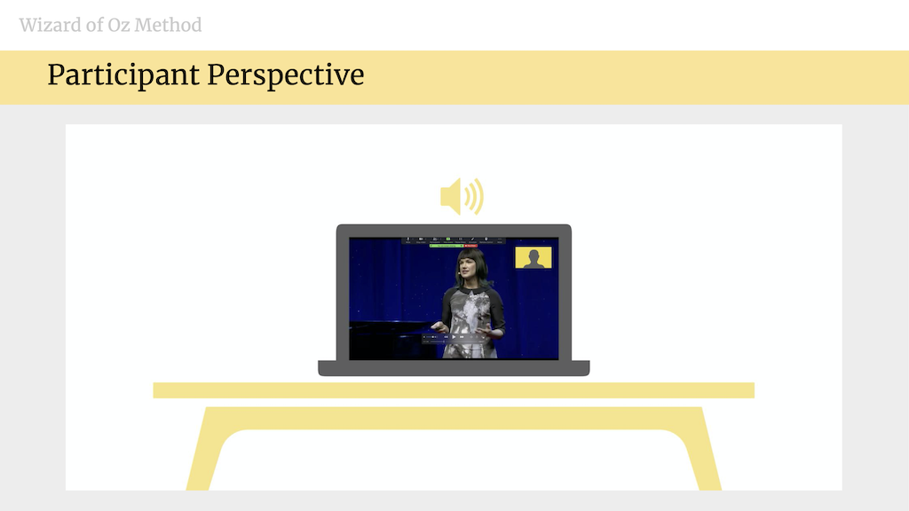
This is the display that was shared with the user during the study and mimicked the user perspective of mixed reality after wearing the DR headsets. You can see that the user is watching a video within the zoom setting.
Using the Wizard of Oz method, we intend to manipulate the audio of a distractor in response to indicators given by a participant while they complete a task. These indicators could be either physical gestures or voice commands, and the task would be watching a Ted talk video.
We decided to have participants use pre-determined physical gestures in an attempt to learn how users would feel about using gestures as a means of control. We also became interested in how well voice commands could be used to diminish a noise and volume based distractor as well. Additionally, we were curious about what potential gestures participants would come up with on their own.
These ideas greatly influenced the design of our study and helped us gather additional information concerning how users would like to interact with diminished reality and what the control system could potentially look like.
Experimental Design
How did the experiment look like:
First of all we ask participants to do a cognitively demanding task while we distract them. A task that does not need a background knowledge.
We picked a TedTalk video about Mars as the second planet. And we played a crowd noise as an auditory distraction.
Based on the errors column of the task analysis table, we highlighted the stages where users may encounter errors that prevent them from continuing to the next step or completing the task.
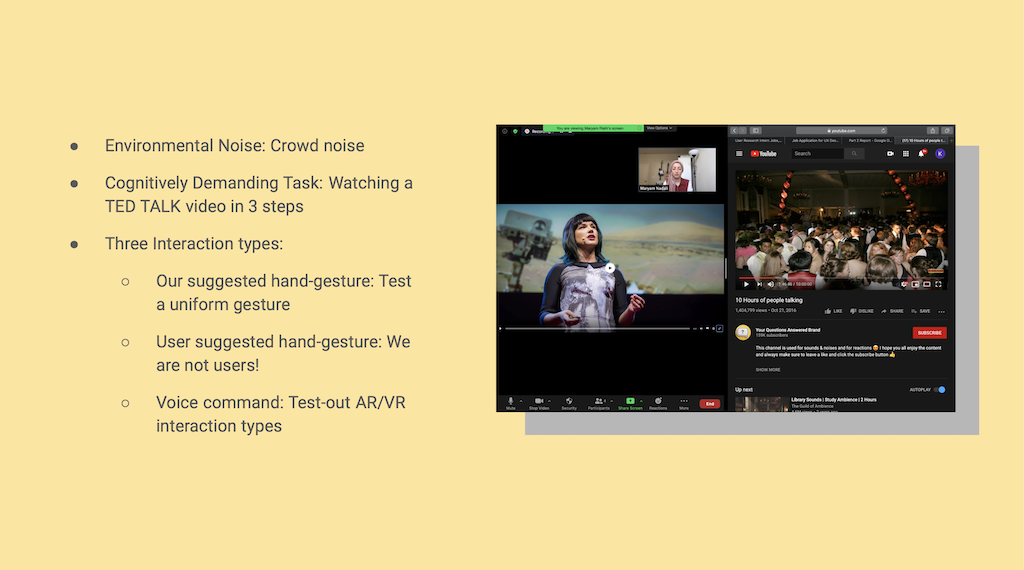
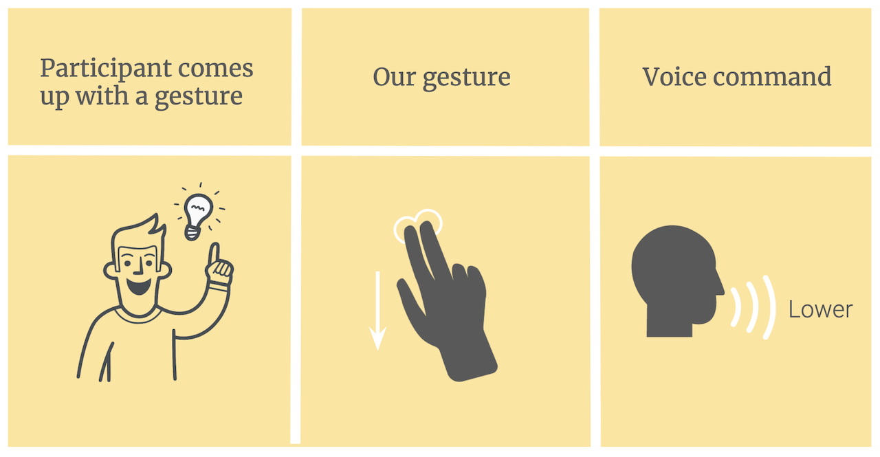
We wanted to evaluate 3 types of interaction in 3 steps by each user so our study is within subject one:
- First, we asked them to come up with a gesture that makes sense to them for lowering the volume because we thought they might make a more intuitive gesture than ours.
- Also we asked users to perform the hand gesture we gave them to use to assess their experience along a uniform gesture as you can see here they used their index and middle finger and motioned from up to down.
- And last but not least they used the voice command “lower” whenever they wanted to lower the noise volume.
To mitigate the effect of learning or fatigue on any of the methods we counterbalanced the order of these steps in the experiment.
Strengths and Weaknesses of Alternate Designs
Our cognitive evaluation of the DR system began by comparing two main designs: whether the system would rely on voice-commands or physical gestures.
Strength: Since using a physical gesture is a visual stimulus and the distracting audio is auditory, it will be relatively easy for the DR system to distinguish between the different sensory sources. The use of physical gestures allows for a faster response time between the user performing the action and the system giving appropriate feedback (in this case, lowering the audio volume appropriately).
Weakness: A counterpoint to using physical gestures is that the user will first need to focus on the hand in order for the system to recognize and anticipate a command.
To further explore the use of physical gestures to control the degree to which an auditory stimulus may be diminished, we evaluated 3 alternative gestures to use as a default setting for the system:
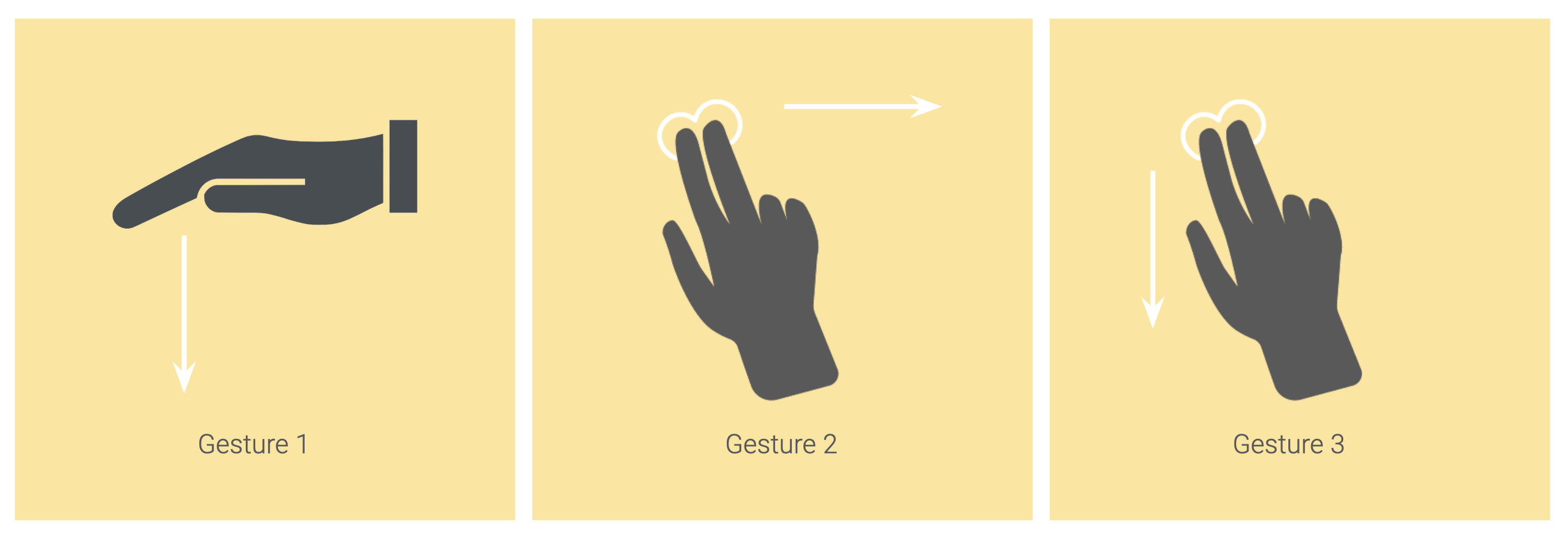
Using two fingers was universally chosen among the designers as a way to signal the desire to change audio level. Moreover, given its simplicity, this gesture has the benefit of being able to be performed rapidly.
It was determined that gesture 3 was the better option for our proposed DR system. The use of 2 fingers allowed for fine movement that could be distinguished from any other movements the user may engage in during system use and could easily be adopted because it mimics a commonly employed action (e.g. scrolling on a touch-screen device).
This gesture however also comes with its flaws. The user may need to perform the gesture each time a reduction in audio is desired (i.e. performing gesture once causes the system to reduce audio by 4 levels. To reduce by 8 levels, gestures will need to be done twice).
Although our initial design involved the use of a predetermined gesture, during our evaluation it was agreed that a user may want to customize their system to their own liking. Not everyone may be comfortable with using a default gesture, so we have included the option of a user-created gesture for further evaluation in later parts of this project.
Design
User Testing
The purpose of this project is to understand how users want to interact with a DR environment, specifically as it pertains to lowering a noise distraction to maintain focus on a specific task.
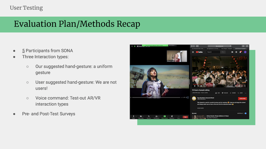
Prior to the experimental task, participants completed the consent form and pre-test survey in Qualtrics. In the survey participants were asked questions concerning how they interact with audio, what functions of technology they employed to decrease volume and how volume typically affects their ability to perform various cognitive tasks.
Consequently, users watched a video in 3 steps and controlled the environmental noise with their suggested gesture, our proposed gesture, and a voice command.
Following the experiment, they completed a series of post-test surveys to give feedback about their overall experience with the simulated conditions. In addition to obtaining qualitative feedback regarding our system-control design, the NASA Task Load Index was completed post-testing to assess participant perception of workload during each task condition of the experiment.
Results
- Pre-task:
- 4 out of 5 participants believed rated gesture more efficient than voice command.
- Post-task:
- No change from pre-task
- Created Gesture:
- Palm open, horizontal, and facing down with repeated up to down motion (2 participants)
- Thumbs down
- Index finger showing down
- Touching ear
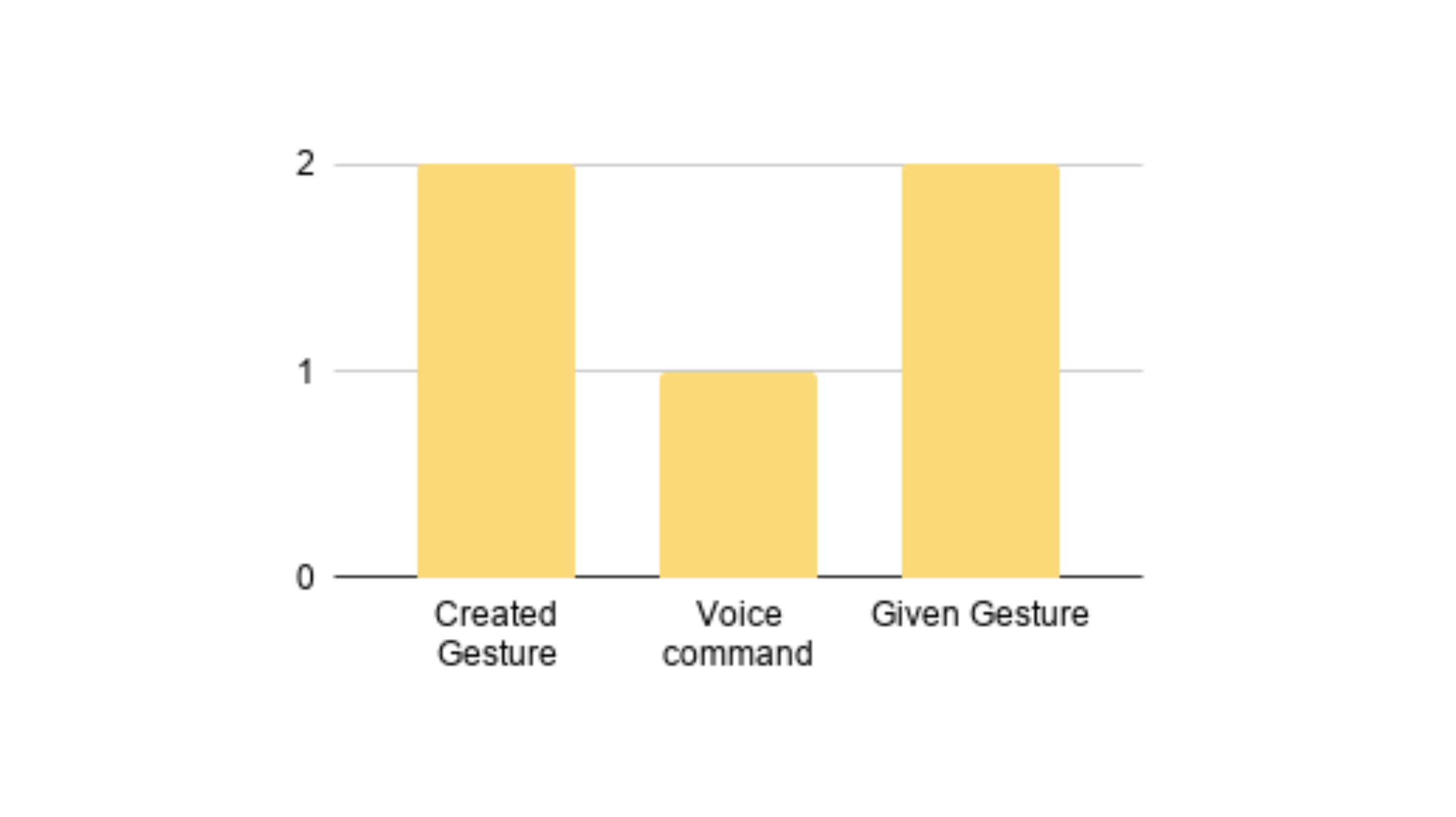
Post-test survey results showed that four out of five participants found using a gesture to be more efficient than voice command when interacting with the system, but one participant preferred voice command.
Among the 4 who reported preference of gesture-control over voice command two found their created gesture better to use, and 2 preferred the assigned gesture thus no overall difference in preference.
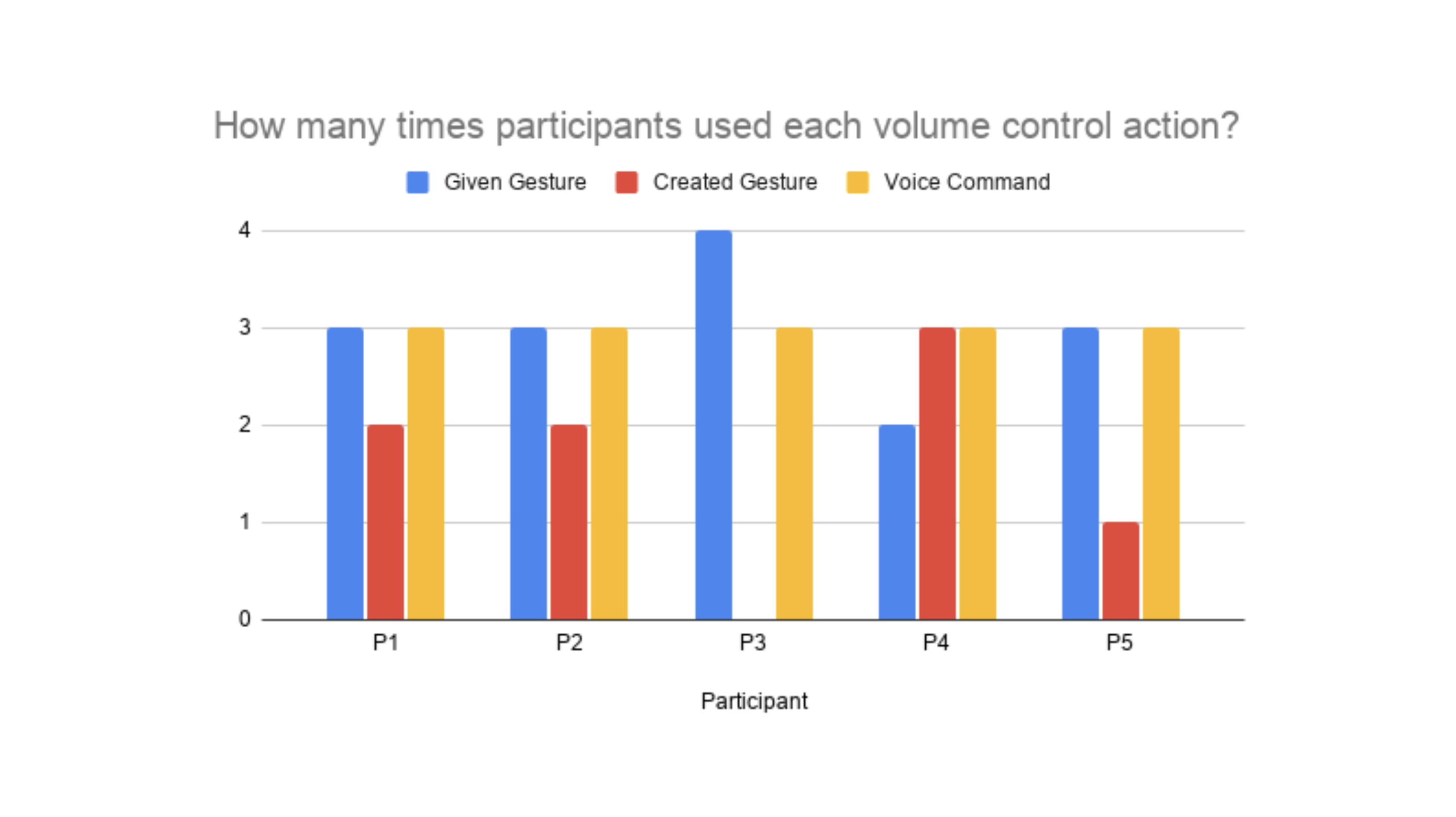
To further explore users behaviour and the volume control actions employed, we calculated the number of times each participant interacted with the prototype.
Frequency of use for each control action reported that the participants self-created gestures felt more intuitive and natural, yet they used that option less often than the other two.
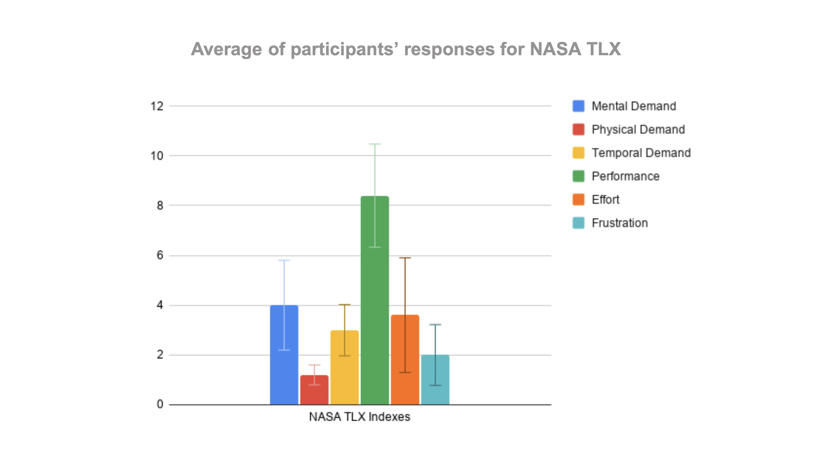
To assess participant perception of task workload and performance, the NASA TLX was used.
Average response regarding NASA TLX: On average the participants did not find the experiment taxing and performed relatively well with little effort.
Final Design Recommandation
Keep unchanged:
- Headset design
- Head size is a factor so use generic measurements.
- Data showed user preference for gestures as method of control
- Voice commands as alternative option
Consider:
- Display changing audio level or sound perception as part of device feedback to the user.
- Remove the option of creating your own gesture.
- Gradual decrease of sound with gesture performance.
- ADA accessibility requirements:
-
- Visually impaired
- Hearing impaired
- Physical range of motion
Mockup Design
Based on the results and storyboard, we made a mockup to show in detail how the user is interacting with audio in the DR headset; Scrolling down using both the index and middle finger.
This gesture made the most sense since it mimics scrolling when using a smartphone, and we envisioned manipulating volume bars in an established system.
Final Prototype Design
Based on results from our study, we determined that our predetermined physical gesture was seen as the best way to control audio, but DR users would benefit from a control system that was multi-modal and had some capacity for voice control as well.
Physical Gesture Prototype Design: This video is a representation of the physical gesture component of our proposed control system. The percentages shown are a representation of the users’ perception of the volume from the two audio streams.
Voice Command Prototype Design: This video is a representation of the voice command component of our proposed control system. The percentages shown are a representation of the users’ perception of the volume from the two audio streams.
Future iterations of this study:
- Run a few test-trials to receive “test feedback” from participants.
- Have participants select from some pre-designed displays in post-test survey to guide design ideation based on preference.
- This can be used to determine whether further revisions to the system need to be made.
- Pursue a larger, more varied sample pool and more consideration to time constraints.
- Once an actual device prototype is available, additional investigations into how the controls affect task performance and other cognitive functions should be conducted to assess whether further revisions to the proposed system are warranted.
Uh oh, you have reached the end of this case study!
Do not worry! I have other projects that are waiting for you to check them out!
Thank you for your time and see you in the next project :)
